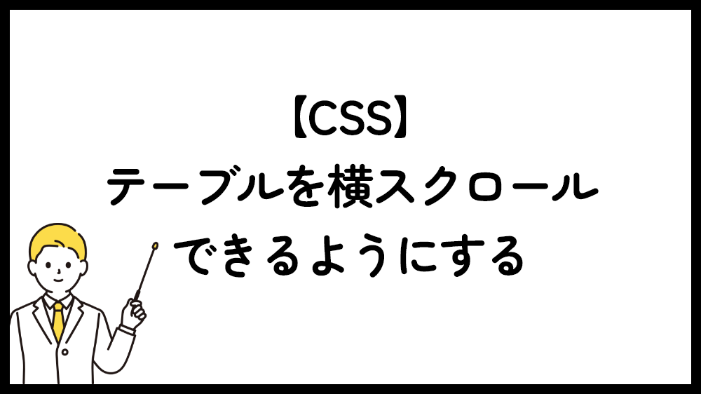
スマホなどのモバイル端末ではどうしても幅が小さく、画面に収めようとすると、表のバランスが崩れてしまいます。
比較表などでよく見かける、テーブルをスクロールできるようにするためのコードを紹介します。
HTML
テーブルタグをdivなどのボックスで囲みます。(下記コードでは div.table-scroll の部分)
|
1 2 3 4 5 6 7 8 9 10 11 12 13 14 15 16 17 18 19 20 21 22 23 24 25 26 27 28 |
<div class="table-scroll"> <table> <thead> <tr> <th>項目</th> <th>詳細</th> <th>価格</th> <th>備考</th> </tr> </thead> <tbody> <tr> <td>商品A</td> <td>説明文</td> <td>1,000円</td> <td>在庫あり</td> </tr> <tr> <td>商品B</td> <td>説明文</td> <td>1,000円</td> <td>在庫あり</td> </tr> </tbody> </table> </div> |
テーブルをスクロールするためのCSS
CSSは下記の様にします。
具体的には、
テーブルの親要素に「overflow-x: auto」を指定し、横スクロールを有効にします。
テーブルに「 min-width 」を指定して、最小幅を指定します。
セルに「 white-space: nowrap」を指定して折り返し禁止にします。(ここはしてしなくても問題はないです。)
|
1 2 3 4 5 6 7 8 9 10 11 12 13 14 15 16 17 18 |
/* テーブルスクロール */ .table-scroll { overflow-x: auto; width: 100%; } .table-scroll table { min-width: 1000px; /* 必要に応じて調整 */ border-collapse: collapse; } .table-scroll th, .table-scroll td { padding: 10px; white-space: nowrap; /* 折り返し防止で横スクロールを促す */ } |
「スクロールできます」を表示
さらに、「スクロールできます」のような表示をテーブルの上に付ける場合のコードです。
HTML
|
1 2 3 4 5 |
<div class="scroll-hint"> <span>スクロールできます →</span> </div> |
CSS
|
1 2 3 4 5 6 7 8 9 10 11 12 13 14 15 16 17 18 19 20 21 22 23 24 25 26 27 28 29 30 31 32 33 |
/* スクロールできます表示 */ .scroll-hint { font-size: 0.9em; color: #666; padding: 2px 6px; border-radius: 4px; overflow: hidden; position: relative; height: 1.5em; text-align: right; } .scroll-hint span { position: absolute; right: 0; white-space: nowrap; animation: sway 2s ease-in-out infinite; } /* アニメーション */ @keyframes sway { 0% { left: 0; } 50% { right: 10px; } 100% { right: 0; } } |